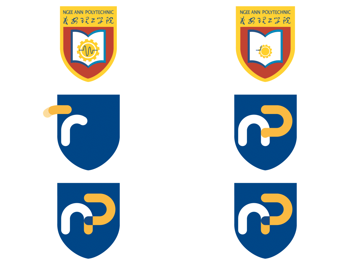
Corporate Logo
Discover the all-new Ngee Ann Polytechnic!
As we celebrate our 60th anniversary, we are excited to unveil a fresh brand identity that embodies our journey, values, and vision for the future.
Check out our new logo in this video.
Here are the whys behind our new look:

THE SYMBOL
The two letters “n” and “p” form the nomenclature by which Ngee Ann Polytechnic is well-known for. The interlocking of the two letters represents the strong connection between the polytechnic and its key stakeholders such as industry partners and the community at large.
The letter “n” flows seamlessly into the letter “p”, symbolizing the dynamic transformation of our learners as they grow into passionate and agile leaders and individuals, which are the hallmarks of an NP graduate.
The opening in the letter “p” signifies the limitless possibilities for our graduates as they acquire the competencies and growth mindset to navigate and thrive in a global workplace.
THE SHIELD
The shield serves as a visual link to the earlier versions of our corporate identity, conveying the rich heritage of the institution. More importantly, it represents the values that we continue to hold as an institution with strong legacy in educating generations of leaders, change-makers and employees who are the backbone of Singapore’s economic growth.


THE LOGOTYPE
The logotype [“ngee ann polytechnic”] has also been updated to feature a typeface that is more contemporary, friendly, and yet dignified.
It also conveys our brand personality that exudes boldness and confidence.
THE COLOURS
The corporate colours used denote the following attributes:
• Blue denotes strength, dignity and solidarity.
• Golden Yellow denotes vibrancy, passion, growth and warmth.
• Black denotes confidence.
• White denotes brilliance, integrity, sincerity and simplicity.
Blue
C 100 M 55 Y 10 K 48
White
C 0 M 0 Y 0 K 0
Golden Yellow
C 0 M 35 Y 85 K 0
Black
C 0 M 0 Y 0 K 90
If you have any questions on our rebrand, get in touch at askNP@Np.edu.sg